Date: 2023
Client: Kenneth C.
Role: Creative Direction & Brand Identity
Plaza Tineca
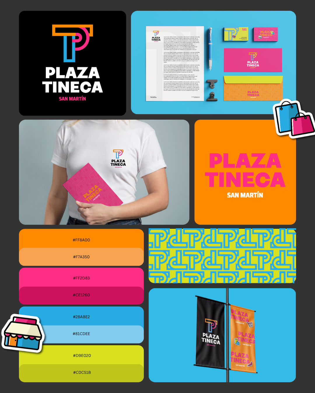
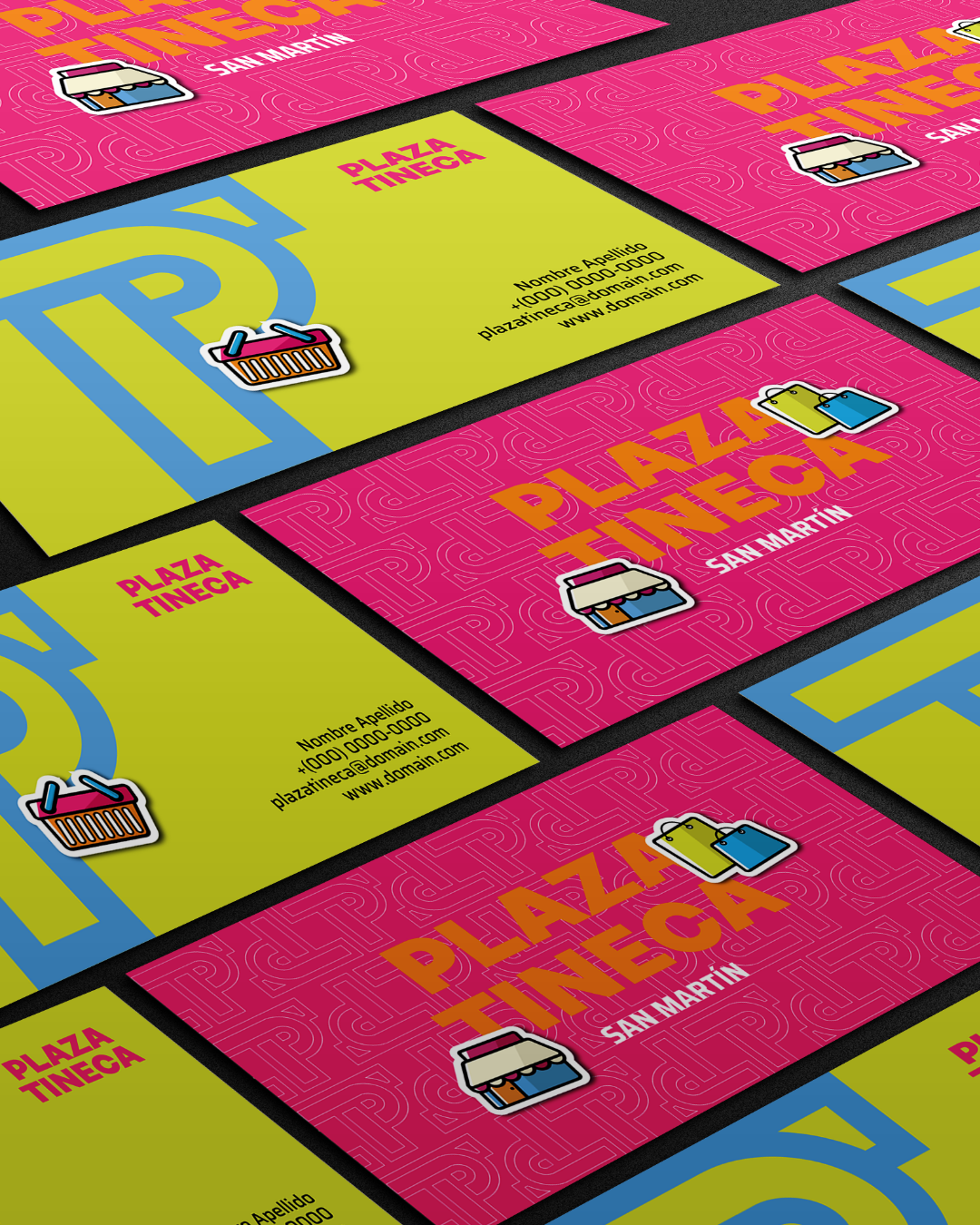
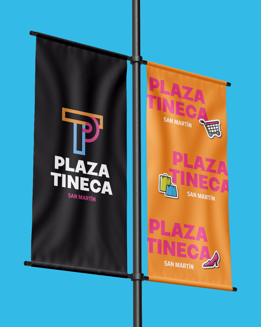
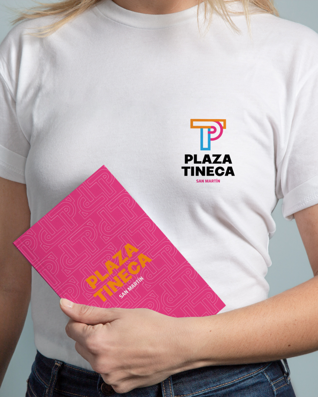
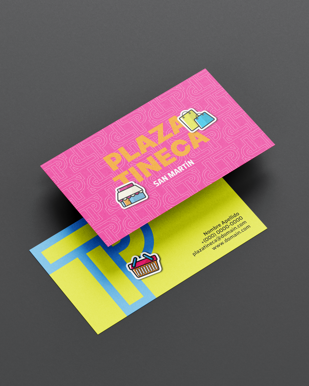
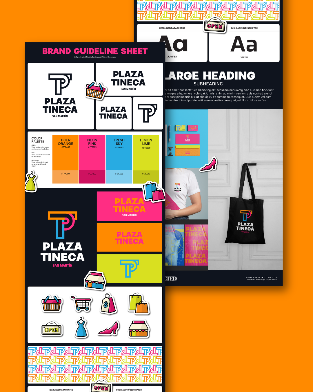
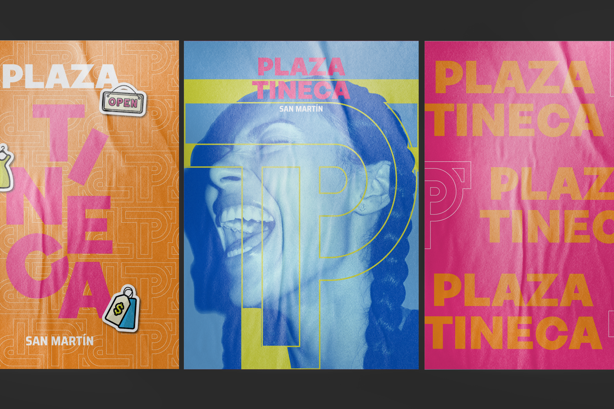
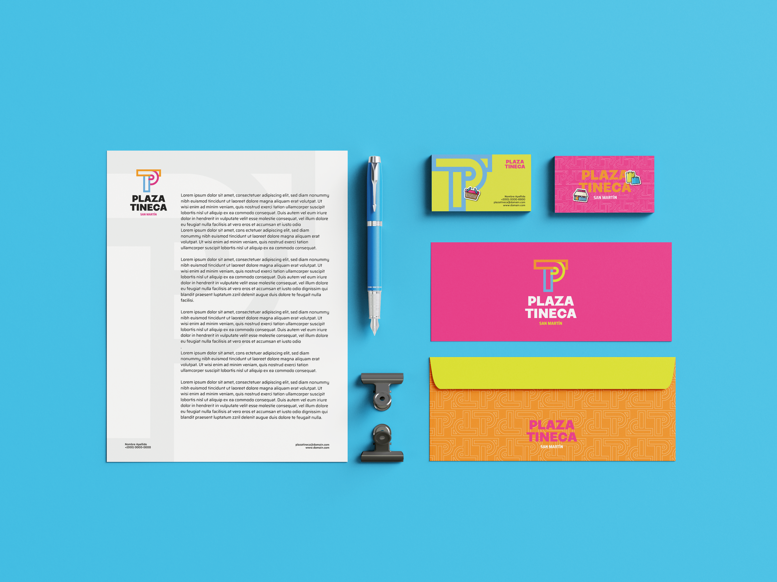
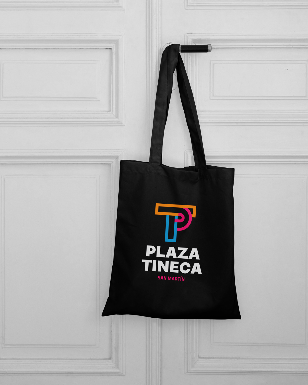
Plaza Tineca’s brand identity was designed to position the commercial plaza as a vibrant and accessible hub in San Martín, where community, retail, and everyday experiences intersect. The visual system is anchored by a bold and geometric “PT” monogram, constructed through layered forms that create a sense of movement, connection, and spatial interaction, reflecting the dynamic flow of the plaza itself. A high impact color palette featuring orange, neon pink, fresh blue, and lime green was selected to evoke energy, diversity, and modern commercial culture, ensuring strong visibility across signage, digital platforms, and marketing materials. Supporting typography maintains clarity and legibility while reinforcing a contemporary and approachable tone. Complemented by playful iconography and modular patterns, the identity system enhances user engagement and adaptability across multiple touchpoints. This cohesive brand identity design positions Plaza Tineca as a recognizable and inclusive destination, built for visibility, connection, and everyday convenience.