JAK of all trades
Date: 2025
Client: Alice
Role: Creative Direction & Brand Identity
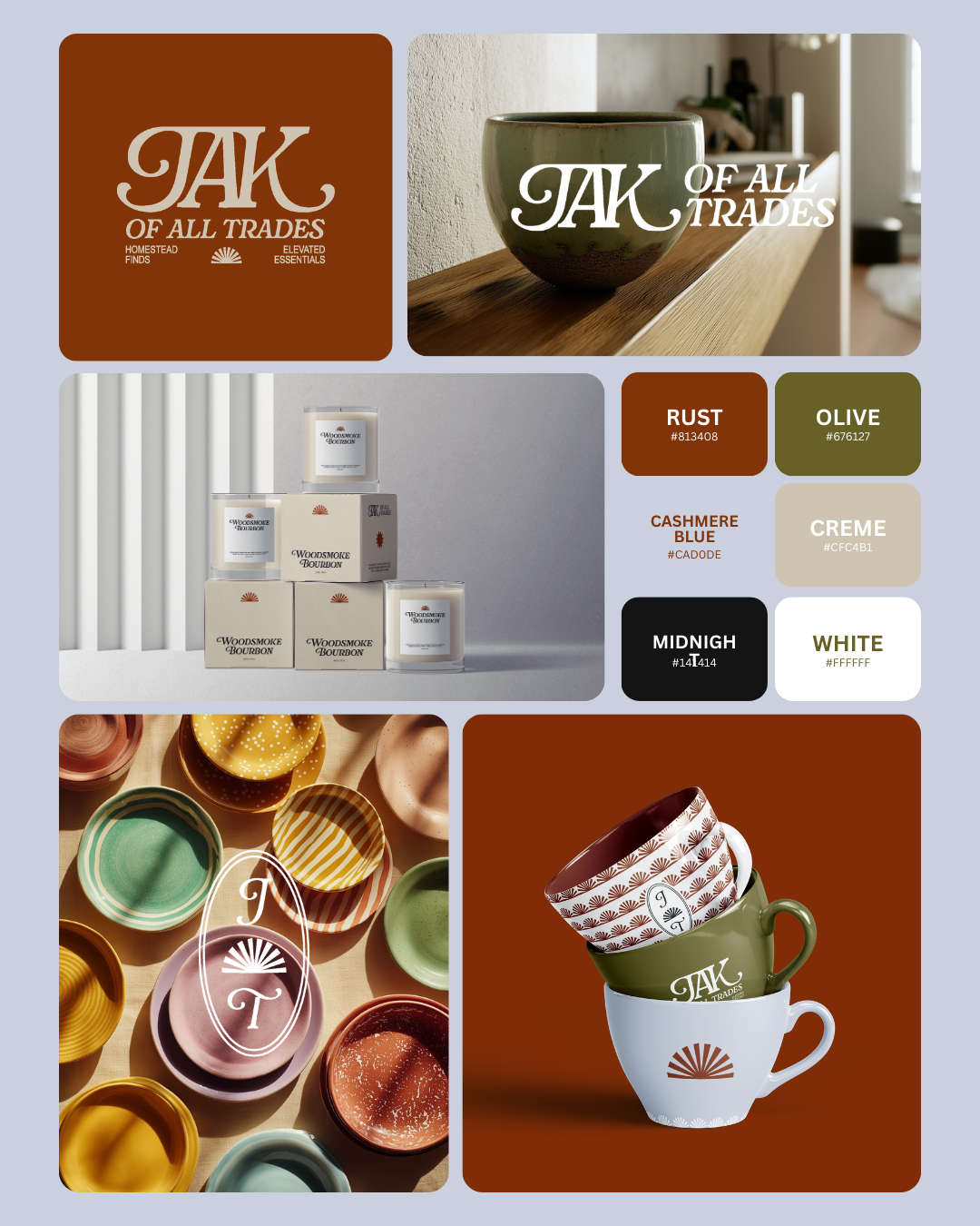
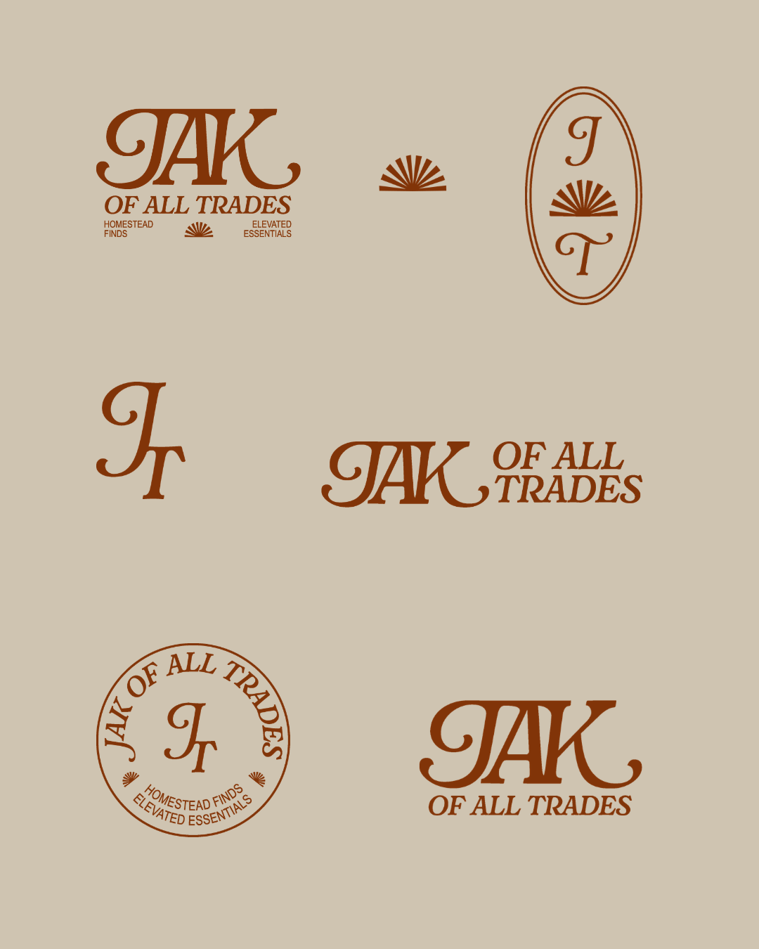
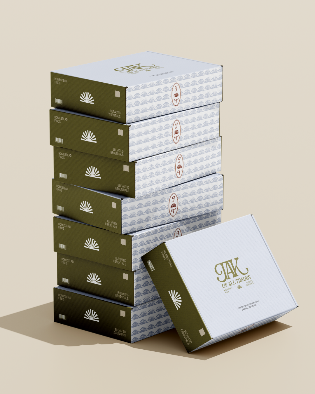
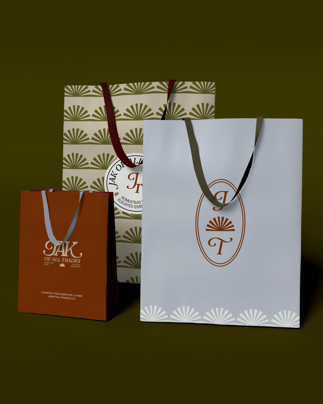
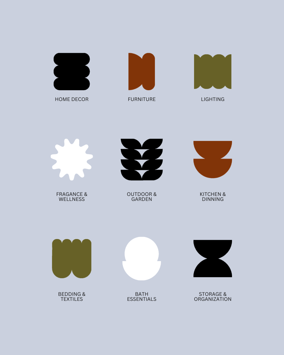
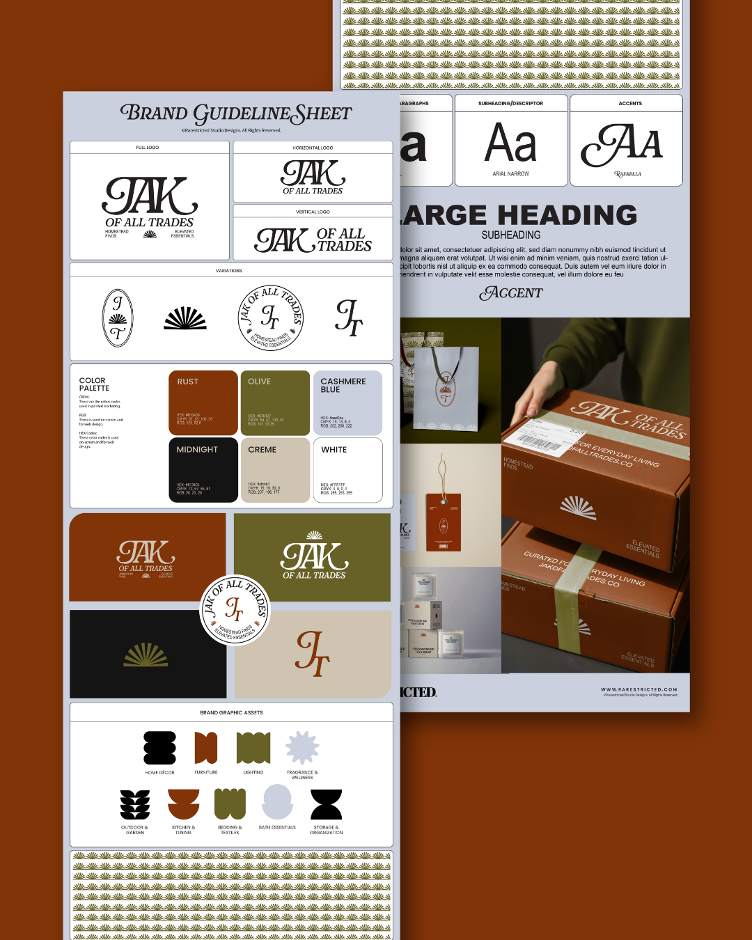
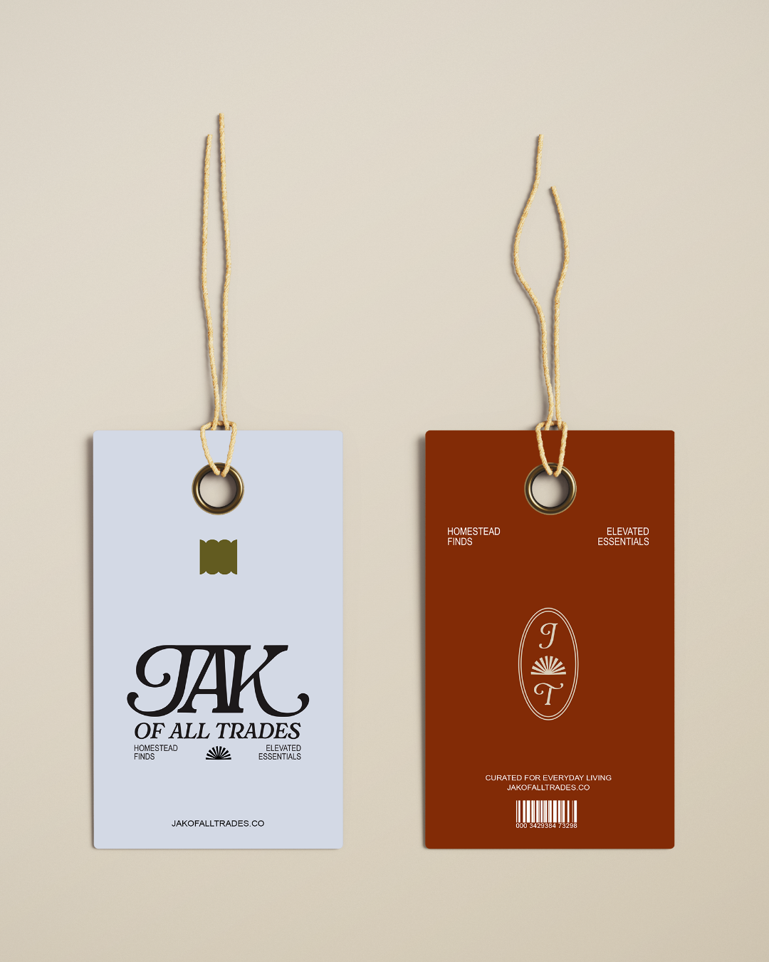
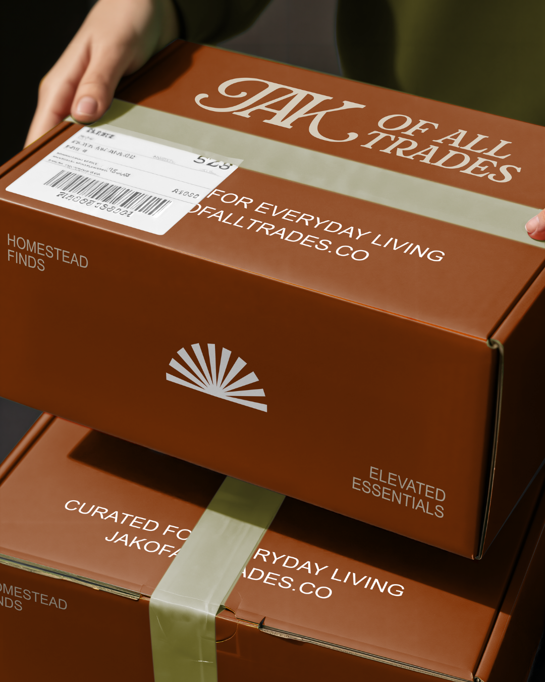
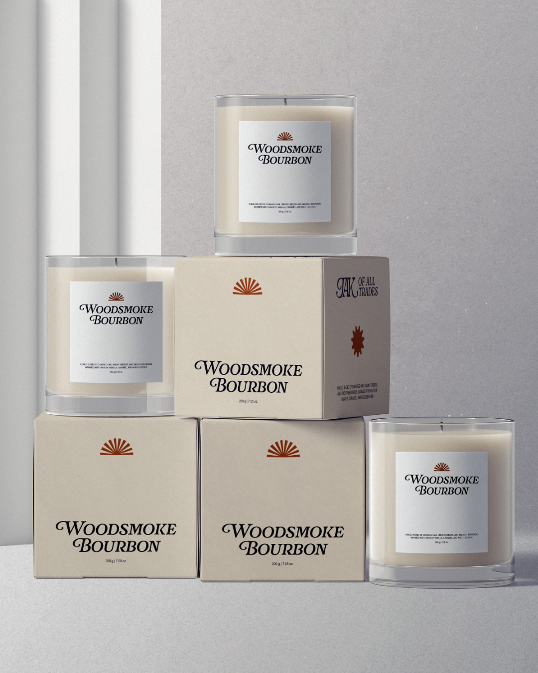
JAK of All Trades’ brand identity was designed to reflect a refined balance between craftsmanship and versatility, positioning the brand as a curated destination for elevated everyday essentials. The custom logotype features elegant serif letterforms with expressive flourishes, creating a distinctive and timeless mark that conveys sophistication, heritage, and attention to detail. Supporting brand elements, including monograms and emblem variations, reinforce a sense of structure and premium quality across packaging and product applications. A warm, earthy color palette of rust, olive, and cashmere blue is paired with deep neutrals to evoke comfort, durability, and a grounded lifestyle aesthetic. Complementary typography introduces clean and highly legible sans serif fonts alongside decorative accents, ensuring both functionality and character. This cohesive brand identity system extends seamlessly across categories, establishing JAK of All Trades as a lifestyle brand rooted in quality, versatility, and elevated design.